Case study · Usability + Content Design · 9 min read
Class CrunchLabs Re-Design
Making onboarding for teachers easy and digestible.
Role
Product Designer
Timeline
6 months
Team
Captain Crunchables with Class CrunchLabs
Context
Team capstone with MHCID at UCI
Outcome
New website and onboarding
Read the full deck ↗
Problem statement
Becoming involved with Class CrunchLabs took too long.
Class CrunchLabs is a free, non-profit, three-dimensional curriculum resource designed for state science standards. With popular entertainer and CEO Mark Rober at the backbone, its mission is to make learning science fun and accessible for students and teachers.
But to invest their time in it, teachers had to read through a long PDF just to become acquainted with the system, which proved too long for their short planning time. The partner brief: talk to real middle school science teachers about how they actually implement lessons, and design a way for them to quickly find relevant content from a unit, without diluting the curriculum itself.
My role
Product Designer.
Responsible for interviews, prototype design, and research plan development.
Problem and solution
Problem: Becoming involved took too long.
Class CrunchLabs’ curriculum is deep by design, built to serve teachers at every experience level. But that depth had become a barrier. To get started, teachers had to read through a long PDF just to understand how the system worked, and then dig through dense units to find the handful of materials they actually needed.
Our research showed why that hurts. Teachers plan in short windows, they want to see how a unit is structured and how long it will take at a glance, and they often cherry-pick activities to slot into lesson plans they already have. A resource that asks for a big up-front read competes with the very time it is meant to save.
Solution: Trust and scanning starts at the website.
We realized trust and scanning start at the website. Over six months we combined a literature review, journey mapping, a competitive analysis of 10 tools, and interviews with teachers to find exactly where the friction was. Those insights shaped three lo-fi directions, from mild to spicy, which we tested with 8 teachers against the original site.
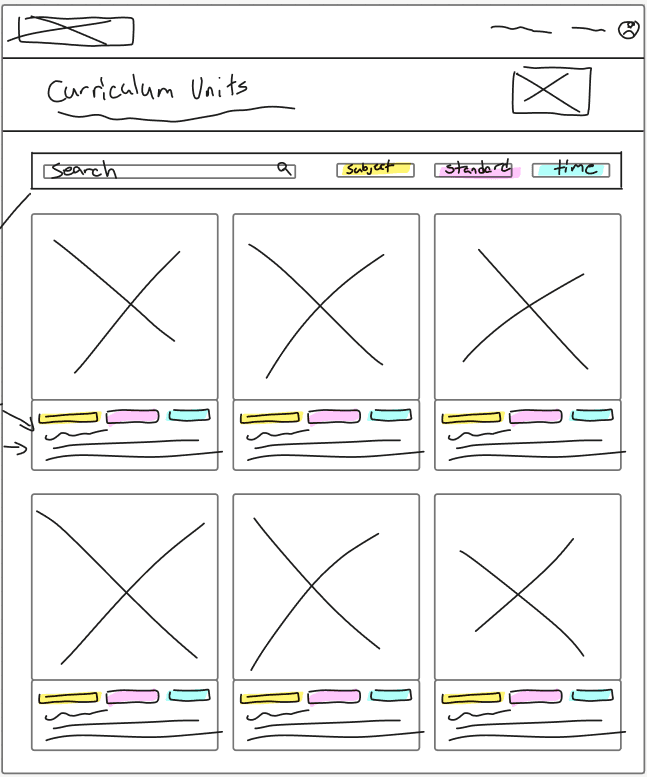
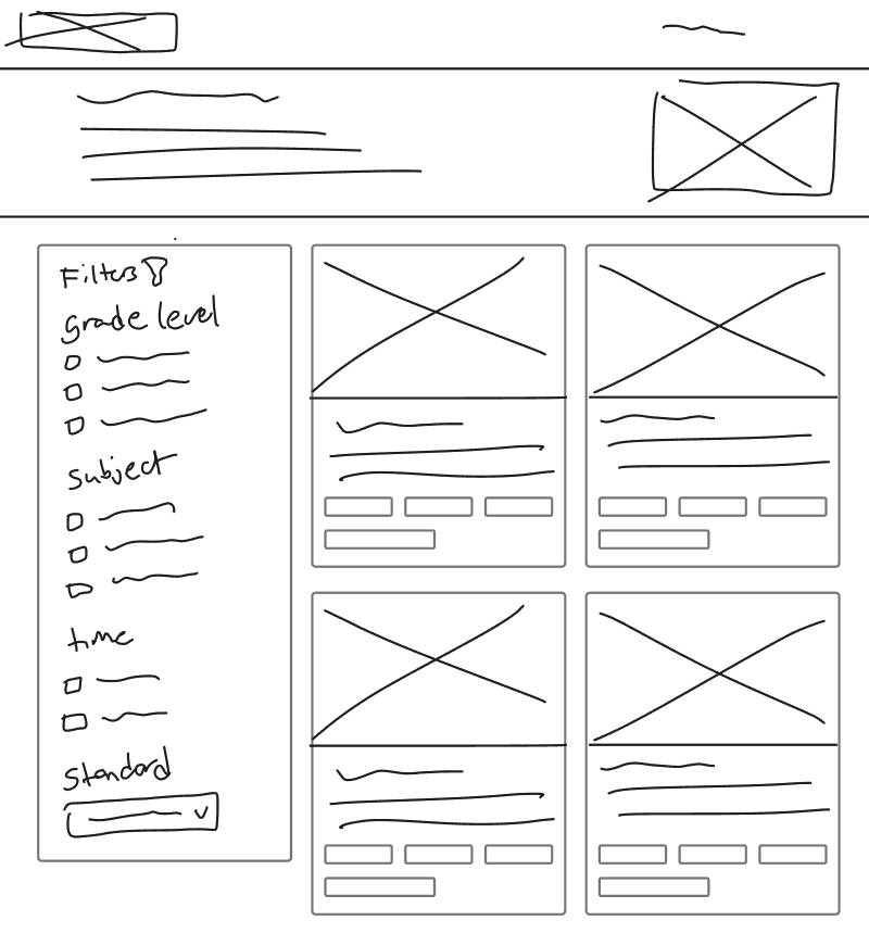
What won was anything that saved time and let teachers scan: a search and filter system, embedded materials, and visible time estimates, built into a modular unit page. In final testing with 6 teachers the prototype earned a 100 usability score, and every teacher said they would use it to plan a lesson. We also left Class CrunchLabs a roadmap: a guide for features they were not ready to adopt, longer usability sessions for the more experimental ideas, a pilot with a real class before launch, and usage analytics to see what teachers reach for most.
Research
Four methods, one six-month sprint.
To understand how teachers actually work, we pursued research across multiple methods. Mapping the end-to-end teacher experience, from standards identification through assessment, surfaced patterns that a single method alone wouldn’t have caught.
Literature review
Reviewed research on how teachers adopt outside materials before talking to anyone. The throughline: teachers want a customizable skeleton, not a finished plan.
Journey mapping
Traced the full path from standards identification to assessment across 5 stages, surfacing where cognitive load was highest and where CrunchLabs could help.
Competitive analysis
Analyzed 10 competitor products to see how other free and paid curriculum tools handled discovery, filtering, and trust.
Teacher interviews
6 teacher interviews, affinity-mapped into opportunities: modular materials, visible time estimates, teacher reviews, real search and filtering.
Synthesis from our data and interviews
Everything we heard and read, clustered into themes. Scroll and zoom to explore.
Key insights
What the research told us.
From all of our research, we landed on these key insights that shaped the way we thought about our prototypes.
Modular lesson building
Teachers take parts from different lesson plans. Allowing for customizability supports their habit of creating unique lessons.
Search and filter system
Quick, enhanced search gives teachers more power to find the correct handout.
A “time taken” section
Teachers plan ahead. A general section showing how long a unit might take is beneficial for planning.
Teacher reviews
Educators value resources made by other educators. Promoting this makes it easier for teachers to buy into the open-source education model.
Adding a conclusion
To better relay a full lesson plan, conclusion-coded wording should be added to show the full outline of the unit.
Prototypes
From sketches to lo-fi variants.
Early sketches
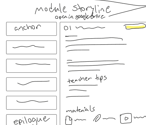
Before any visual polish, we sketched three directions for how a teacher moves from “I have a standard” to “I have a lesson.” Each tests a different way to surface the same core need: fast filtering and a clear path through a unit’s structure.
Lo-fi variants
Rather than testing one lo-fi direction, we scoped three variants along a “mild to spicy” range, each adding progressively more new structure on top of what CrunchLabs already had. This let us test how much change teachers actually wanted, instead of assuming the boldest idea was the best one.
Mild
Low change
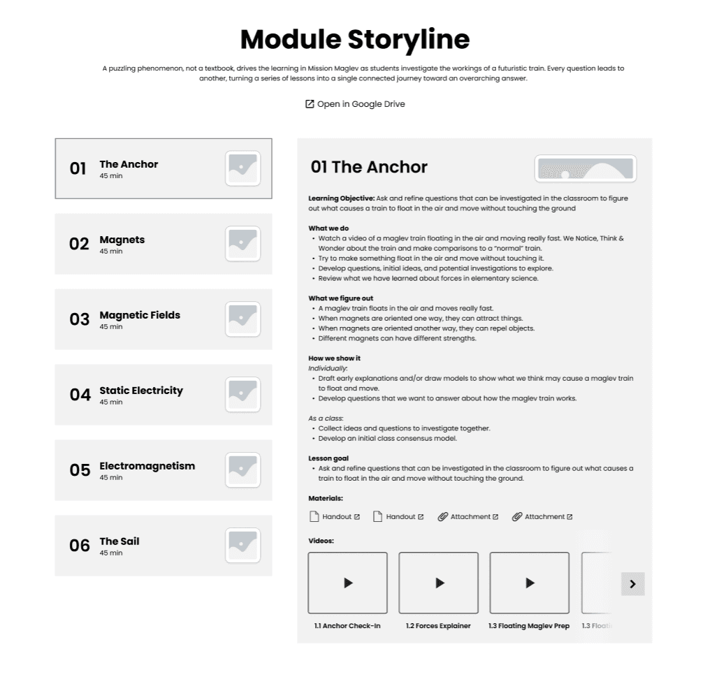
Module storyline
Keeps CrunchLabs’ existing lesson list, adding a structured objective, materials, and video breakdown per lesson.

Medium
Medium change
Materials
Introduces a dedicated handouts, videos, and activities view with a lesson sidebar and peer teacher tips.

Spicy
High change
Unit overview
Adds a full unit dashboard: at-a-glance stats, a three-dimensional framework breakdown, and teacher reviews.

Testing prototypes
8 teachers, 4 prototypes.
We live-interviewed 8 teachers to get honest reactions to each prototype’s usability. To give them a real point of comparison, we added the original Class CrunchLabs website as a fourth, baseline lo-fi prototype, so we could see not just which new direction teachers preferred, but how much of an improvement any of them were over what already existed.

The four prototype flows we tested with 8 teachers. The original website was the most common last choice, while the spicy prototype won the most first-place votes.
Final prototype
Save teachers time, help them scan.
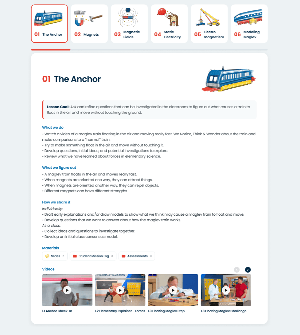
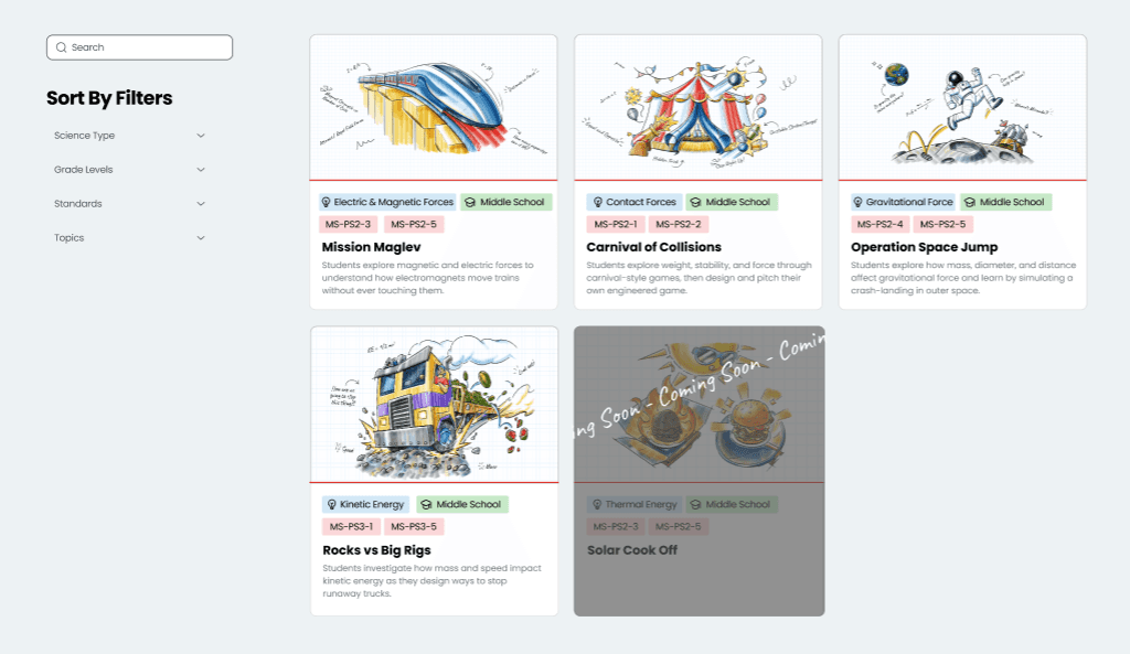
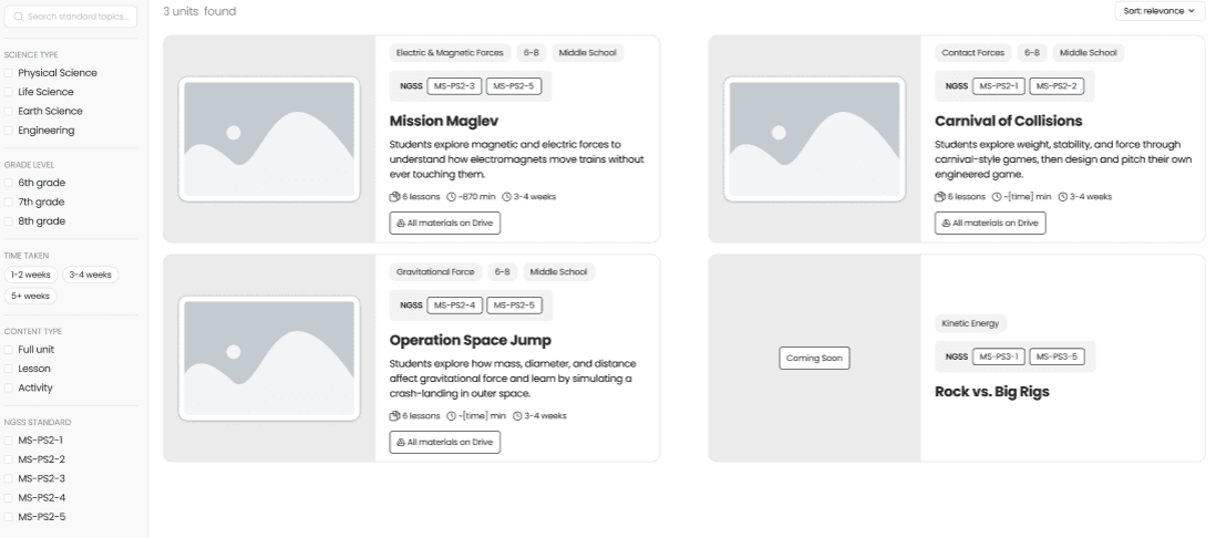
Across the three lo-fi variants, one thing stood out above everything else: what teachers valued most wasn’t any single new feature, it was anything that saved them time and let them scan a unit quickly. Embedded materials came up again and again as the difference between opening a unit and actually using it, since teachers didn’t want to leave the page to hunt through a separate folder.
That finding decided what made it into the high-fidelity prototype. We combined the filter system, embedded materials, and time estimates, the three features that most directly saved teachers time, into a single design instead of carrying every idea forward.
Drag to compare · arrow keys when focused
Drag to compare · arrow keys when focused
Open the interactive prototype ↗
Final testing
100 usability score across 6 teachers.
With the high-fidelity prototype built, we ran a moderated usability test through Maze with 6 middle school teachers across 16 tasks. The tasks covered browsing curriculum by filter, opening a unit, reading through the storyline, finding materials for a specific lesson, and checking other teachers’ reviews.
Usability test
View the full Maze report
Open in Maze ↗
Overall usability score
Completed the core browse and open flow, no drop-off or misclicks
Average trust rating, every teacher gave the top score
Said they would use the site to plan a lesson
What worked
Teachers consistently called out the amount of text on the storyline page as just right, enough to judge whether a unit fit their classroom without digging further. Several said they were ready to use a unit as is.
“I plan on using this unit in my classroom already, so nothing more is needed.”
Participant, Maze usability test
“It’s exactly enough without being overwhelming. I have enough knowledge to know if it’s a unit or lesson I want to use in my classroom based on the text of the storyline, without digging too much further.”
Participant, Maze usability test
What still needs work
Testing also surfaced two real gaps. One teacher tried to click into the supplies list for a lesson and found it wasn’t wired up yet, so she couldn’t confirm what materials she’d need. Another had trouble telling apart similarly named lessons, like contact and noncontact forces, since the filter tags weren’t functional yet. A third raised a constraint outside the design itself: planning time. “There is a lot to digest. Planning time is limited,” she said.
A note on scope: this wasn’t a full-scale study. Time constraints kept the participant pool small, so these results are directional rather than conclusive. What they do give Class CrunchLabs is a clear read on which direction to take the redesign next.
What I Learned
Class CrunchLabs was our first time carrying a project the whole way through, from a partner brief to a tested prototype. That full arc taught us things a class assignment never could: how to write a research plan, and what it feels like to sit across from a real teacher and ask about her classroom instead of guessing on her behalf.
Not every stretch was smooth. We hit real roadblocks: disagreements over direction, pushback on ideas we were attached to, and decisions we thought were settled that we had to reopen. Working through that taught us more about collaboration than any part of the project that went according to plan.
By the end, that same group had put together something we’re genuinely proud of: a prototype built on real interviews, tested with real teachers, and pointed in a direction Class CrunchLabs can actually build on.
Next step
Let’s work together.
I’m looking for my next product design role. If this work is the kind you need, I’d love to talk.